
BWARE
Post-Wildfire Natural Hazards
Dashboard
Quick Start Guide
-
The BWARE Post-Wildfire Natural Hazards Dashboard can be viewed on any internet browser using either a personal computer or mobile device. You can always access the Dashboard from our homepage, but to get there directly you can use the following URL:
https://simonfraseru.maps.arcgis.com/apps/dashboards/fae2ff2831ef4c039032991a5a2fa612
For the best experience, we recommend viewing the Dashboard on a large external monitor, but it will still work with smaller screens (laptops & mobile devices). -
Disclaimer of Warranty. While reasonable efforts have been made by the creators of and contributors to this website to verify the accuracy of the data presented, the information on this website may contain errors, omissions, or other inaccuracies. Access to this website is provided on an "AS IS" basis and without any warranties, either express or implied. This website, along with the data that underlies it, should be used for informational and reference purposes only and any use of the information provided is not a substitute for consultation with a qualified expert. You are solely responsible for determining the appropriateness of using the provided information within the limitations of the licensing permissions and assume all risks associated with your use of the content provided on this website.
Limitation of Liability. No creator of or contributor to this website’s content shall be liable to you for damages, including any direct, indirect, special, incidental, or consequential damages of any character arising as a result of your use (or inability to use) this website, even if advised of the possibility of such damages. Within the restrictions of the copyright license, any use or distribution of this website and its content are your sole responsibility and only permitted if you agree to indemnify, defend, and hold each creator and contributor harmless for any liability incurred by, or claims asserted against, by reason of your accepting any such warranty or additional liability assumed by your use or distribution.
Copyright License. Redistribution, reproduction, or reuse of this dashboard or its associated data is permitted only under the terms of the Creative Commons Attribution-NonCommercial-NoDerivatives 4.0 International License (CC BY-NC-ND 4.0). Any use beyond those terms requires the prior written consent of Dr. Brendan Murphy. Third-party data incorporated into this website are all referenced and retain their original ownership and licensing terms. Users are responsible for reviewing and complying with those terms where applicable. For more information about the CC BY-NC-ND 4.0 license, you can visit: https://creativecommons.org/licenses/by-nc-nd/4.0/
Submission of Contributions. Unless you explicitly state otherwise, any contribution intentionally submitted by you for inclusion on this website shall fall under the terms and conditions of this agreement, without any additional terms or conditions.
Trademarks. Any use or distribution of this website or its content does not grant you permission to use the names, trademarks, logos, or other copyrighted content of the creators, except as required for reasonable and customary use in describing or referencing the origins of the content used.
-
The BWARE Dashboard has a lot of functionality available to filter the data and modify the interactive graphs.
To learn more, see the Dashboard Functionality section below for more details!
-
Limitation #1: Dashboard Scaling
Small Desktop Screens:
If you are attempting to view the Dashboard on a smaller desktop screens, such as on laptops or tablets, the charts displayed in the side panels, the pop-up windows with feature attributes, data filters, and other features may be scaled down smaller than we intended and become more challenging to engage with (note: we have a separately designed dashboard for viewing on mobile devices).
Recommendation:
For the best desktop experience, we recommend using an external monitor (20” or larger). If that's not an option, then you can try manually re-size the dimensions of particular elements of interests (e.g., pie charts) by hovering your cursor at the edge of the element, then clicking and dragging the border that appear to re-size it (indicated by the red arrow within the map extent below).Additionally, you can expand (and then un-expand) any element of interest so that it takes up the full display window by clicking the “Expand” button in the top-right corner of the element: (indicated by the red arrow on the “Hazard by Fire Year” graph in the Right Panel above)
Large Screens with Wide or Tall Aspect Ratios:
When viewing the Dashboard on larger monitors with aspect ratios that do not conform to the more common 16:9 ratio, the initial global map extent can sometimes load with additional black space around it. In these cases, we have found that some of the dynamic Dashboard features (hazard count indicators filters, charts, etc.) do not calculate or accurately display values.
Recommendation:
To ensure all the dynamic features are displaying accurately, adjust the zoom extent of your map so that it entirely fills the entire area (i.e., no black borders). Depending on your screen dimensions, it is possible this may require slightly adjusting the width of the map/side panels (see recommended solution above).
Limitation #2: Cluster Aggregation
ArcGIS Online (the product used to create the Dashboard) has limited capabilities with respect to feature customization, with one notable example being the settings available for cluster aggregation. As mentioned in our explanation about the Clusters, the algorithms used for clustering features are only based on their location and cannot be adjusted to limit clustering based on feature attributes or based on a certain spatial extent (e.g., national borders). Additionally, the summation of data within any given cluster is strictly based on the number of aggregated point features and cannot be adjusted to alternatively calculate the sum of any numeric attributes from among the aggregated features (e.g., number of hazards). This limitation presents two key visualization issues:
Due to the inclusion of “General” point features in our database (i.e., point features that represent more than one identified hazard), cluster sizes are not always proportionally scaled to accurately reflect the actual number of hazards represented by the clustered points.
At global or multi-national zoom extents, cluster aggregation is not strictly based on the country in which hazard point features are located, despite the color symbology for the hazard points being set as such. When aggregated into clusters, ArcGIS Online instead colors each cluster based on which country has the largest number of hazard features.
Recommendation:
First, the current cluster customization options available in ArcGIS Online do allow for displaying values on the clusters that are summations calculated based on numeric attributes from the aggregated features. Therefore, even though the proportionate scaling of cluster diameters is strictly representative of the number of aggregated point features, we have made sure that the values displayed on the clusters do accurately reflect the total number of hazards identified with that cluster. This approach may, however, result in apparent inconsistencies between the relative size cluster sizes and their stated values.
Second, while cluster colors at broader zoom extents reflect the country with the most hazard point features included within the cluster, we have set up the Dashboard so that you can click on any cluster and within the pop-up window see the total number of hazards (not point features) associated with each country in that cluster –this number should add up to the value displayed on the cluster.
We are hopeful that ArcGIS Online will update this functionality at some point, but until that time, this was the best approach we could find for visually displaying the global dataset across a wide range of zoom extents and filters.
Dashboard Functionality
Click On Different Sections of the Dashboard Below to Learn More.
Hazard Count Indicators
Pie Charts
Map
Viewing Features & Attributes
Modifying Content
Filters
Time-series Graphs
1. Hazard Count Indicators
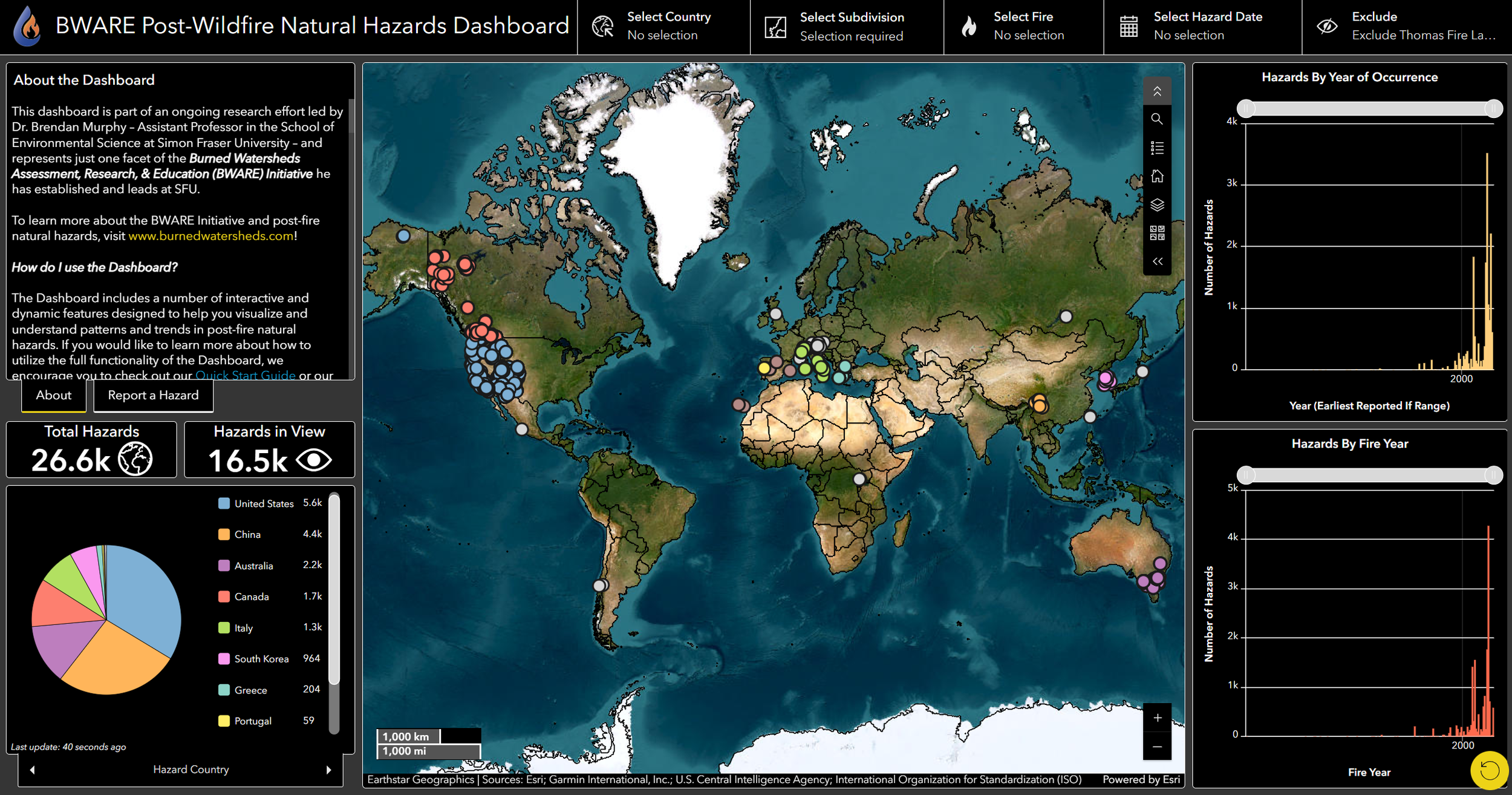
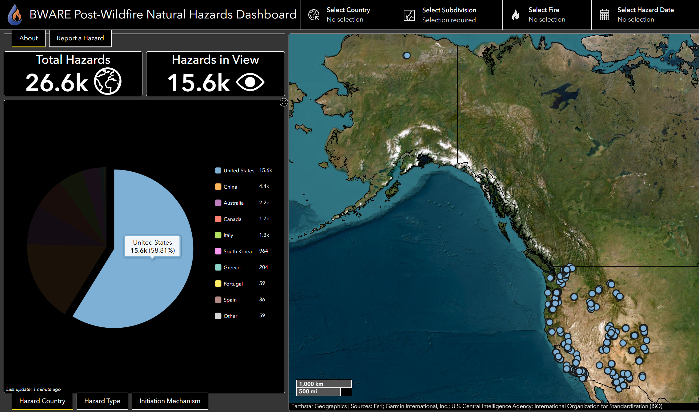
The count indicators display the number of post-fire natural hazards in two ways:
Total Hazards
the total number of hazards in our database
Hazard in View*
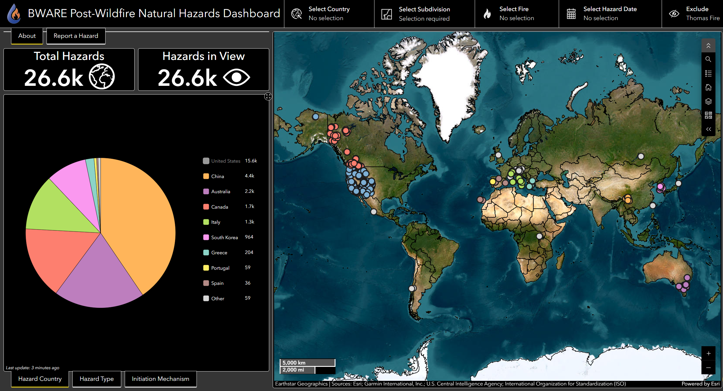
the number of hazards currently within the visible extent of the map - this count is dynamic with applied filters
*note: if there is any black space around the map edges, such as at zoomed out global extents, then the number of Hazards in View may not display values accurately.
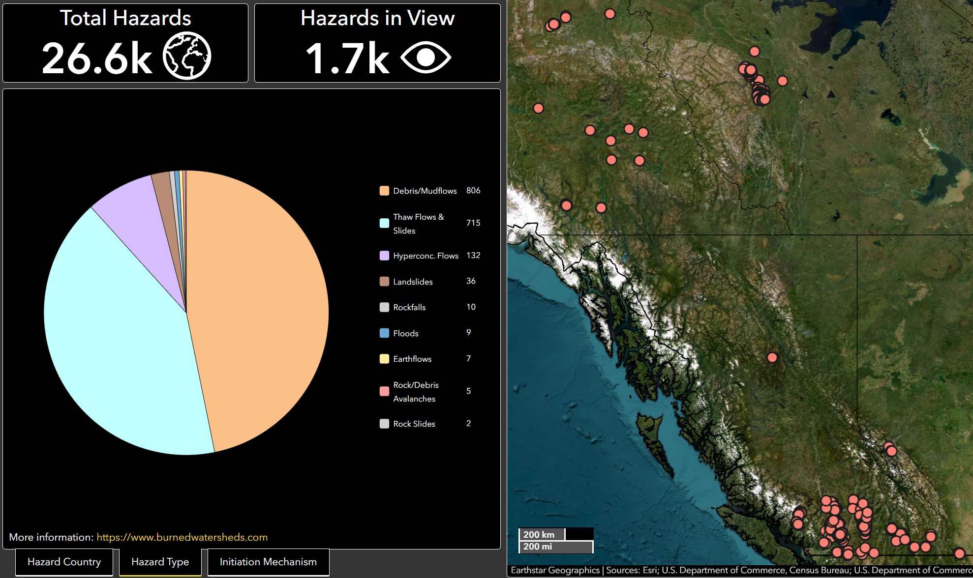
Example of the Hazards in View after the database is filtered to show Canadian hazards.
2. Pie Charts
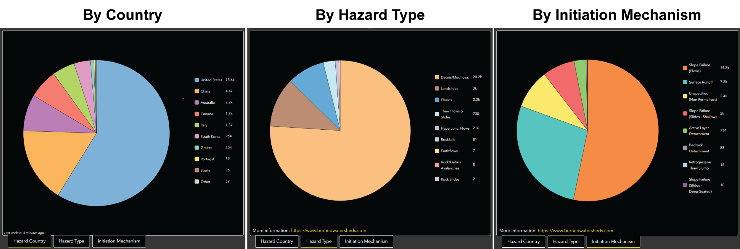
The BWARE Dashboard has three pie charts to view distributions of different categorical groupings of the hazards data. The default pie chart when the Dashboard is opened is the number of hazards by country. You can view the other two pie charts by clicking on the tabs below the pie chart. On smaller screens, these tabs may not be visible, but you can switch between charts either by clicking on the left or right arrows on the single tab below the chart or by selecting a different pie chart name from the pop-up menu that appears when you click on the tab.
Functionality 2: Clicking on a slice within a pie chart to filter the hazards shown in the map. This will also update the data plotted in other graphs. For example, if you click on the “United States” slice within the Hazard by Country pie chart, the map zooms to an extent that includes all US hazards, all non-US hazards are filtered from the map. This functionality can be applied to single or multiple slices of a pie chart. To undo this filter, simply click on the slice again.
Functionality 3: If you want to visualize the distribution of categories for any pie chart without certain categories included, then you can remove either single or multiple slices from a pie chart by clicking on the colored square(s) in the legend.
Once clicked, the legend square should turn grey and the pie chart will display recalculated proportions with the clicked categories excluded. An example at left shows the Hazards by Country pie chart with US hazards excluded.
This function does not remove hazards from the map or adjust other graphs like when you click on slices (Functionality 2).
To add filtered categories back into the pie chart, click on the greyed-out squares in the legend.
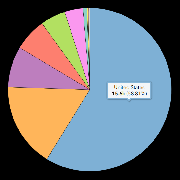
Functionality 1: To view the percentage of any slice within a pie chart, simply hover your mouse over the slice and the name, value, and percentage will appear in a pop-up window over the slice.
3. Map
Modifying the Visible Content
To modify the visible content, you can open the Map Tools by clicking on the black square icon with two downward arrows located in the top right corner of the map (highlighted in red below). When clicked, the tools menu will expand to show six options. You can collapse the Map Tools by clicking the same icon.
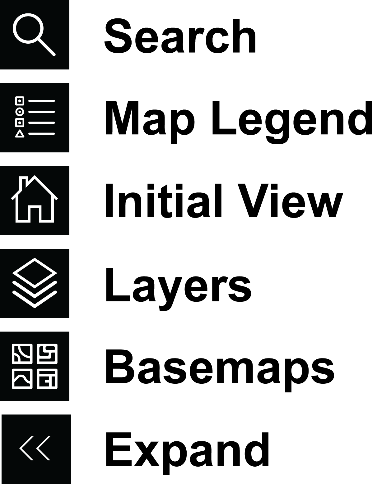
Search: click to search and zoom to a specific location, address, or coordinates
Map Legend: click to expand to view the legend and symbology for visible map layers
Initial View: click to return to the initial global zoom extent
Layers: click to view all available map layers
If a layer is turned off, then to the right of the layer name you will see an eyeball icon with a slash through it.
To turn any visible layers off, click on layer name.
To make a layer visible, simply click on layer name again. The slash will then disappear to indicate the layer is now visible.
Layers visible by default include:
Hazard Points (“Post-Wildfire Natural Hazards”)
Fire Perimeters (note: viewable at or beyond subdivision zoom extent)
Geographic Boundaries (ESRI)
Optional additional layers:
Köppen-Geiger Climate Classification Map (1-km resolution)
Basemaps: click to see and select alternative basemaps.
The default basemap is ESRI’s ‘Imagery’ layer. Other options include Topographic, Terrain, Streets, etc.
Viewing Features & Attributes
Zooming In/Out
There are two ways to zoom in and out of the map. You can simply scroll up/down with your mouse or trackpad. Or, you can click the plus or minus buttons in the bottom righthand corner of the map.
Feature Attributes
To view the attributes of any feature on the map (hazard, wildfire, etc.), simply click on the point or polygon and a pop-up window will appear on the map that displays the clicked feature’s attributes.
You can minimize or close any pop-up windows by clicking the icons in the upper right corner of the pop-up window.
Full Screen Map View
You can expand any panel of the dashboard, such as the map, to take up the full extent of the dashboard by clicking on the “Expand” button in the top right corner of each panel (an x with arrows). Note, this button only becomes visible when you hover your cursor over a panel.
You can un-expand a panel and return to the standard dashboard view by clicking the same button again.
Reset
You can reset the dashboard - returning to the default view and removing any applied filters - by clicking the “Reset” button located in the bottom right corner of the Dashboard (a yellow circle).
Features
Hazard Points
Exact Precision Points -
If the exact location of an individual hazard was reported by a source, then it is represented on the map as a single point and within the attributes of the point, the location precision will be reported as “Exact” and the point type will specify whether it shows the location of the hazard initiation (for example, a landslide scarp), deposit, or watershed outlet.
General Precision Points -
If the original identifying source did not report the exact location(s) of hazards and they could not be determined by the BWARE team by reviewing the published tables, figures or maps, then the location precision of a point will be reported as “General”. Some general precision points represent only a single hazards, but others may represent multiple hazards (in some cases over a thousand). Hazard events were only grouped together in this way if they were of the same reported hazard type (e.g., debris flow vs. landslide), attributed to the same wildfire, and shared the same occurrence date (or estimated date range). The total number of hazards associated with a general precision point is listed within its attributes.
Hazard Attributes -
The BWARE team has compiled a large multitude of attributes related to all of the hazards in our database, however not all of these details are displayed in the Dashboard. Despite our efforts, some hazards may not have a complete set of Dashboard attributes due to limited information provided (or able to be ascertained) by the original source. One attribute that is frequently challenging to determine is the exact date of occurrence.
Nevertheless, every hazard point in the Dashboard will include the following attributes:
Unique BWARE ID
Country
Subdivision (state/province)
Climate class (Köppen-Geiger)
Ecosystem type (World Terrestrial Ecosystems)
Hazard movement type
Fire year
Hazard year (earliest, if ranging calendar years)
Location precision (exact or general)
Number of hazards (associated with point)
Reference of original source
Fire Perimeters
Currently, the Dashboard includes perimeters for wildfires attributed to post-fire natural hazards that have occurred in both Canada and the United States. We are actively working to compile fire perimeters from other continents and countries and will add more soon!
In some locations, there are multiple official sources that publish information and geospatial data about wildfires (e.g., federal vs. state/provincial agencies), and this information may differ slightly. For this reason, we include the source of the geospatial data presented in the Dashboard within the attributes of every fire perimeter.
Fire perimeters will appear on the map after you zoom into a particular region. Once they appear, you can click on a perimeter to view its attributes.
In addition to the source of the fire perimeter, feature attributes include:
Unique BWARE ID
Country
Subdivision (state/province)
Dominant climate class (Köppen-Geiger)
Dominant ecosystem type (World Terrestrial Ecosystems)
Fire name
Fire year
Cause of the ignition
Ignition Date
Containment Date
Burned Area (ha)
Number of hazards attributed to the fire